There are two things that are fundamental to web designs, art, and photography. That first thing is light and the second is composition. Eric Anderson’s portfolio is a great example of this. As we begin to see the digital world consume print materials and transform them into interactive works of art there comes a stronger need for better light and composition in designs and photos. Here are some common mistakes to avoid when designing or taking a photo for web use.
Too many light sources
A lot of the time designers forget that even though he computer screen is a flat surface it is perceived as a 3D space. As such you must remain aware of how many light sources you have spreading light across your page. And don’t forget about your photography skills here. The light effects in them can, but not always, add or take away from your beautiful layouts and illustrations.
Depth in website design: Bright things attract, Dark things retract
The brighter you make an object the more it will stand out on a page. The darker the object the more it will fall into the back and remain hidden. This of course has to be worked in combination with proper contrast but the idea is still the same.
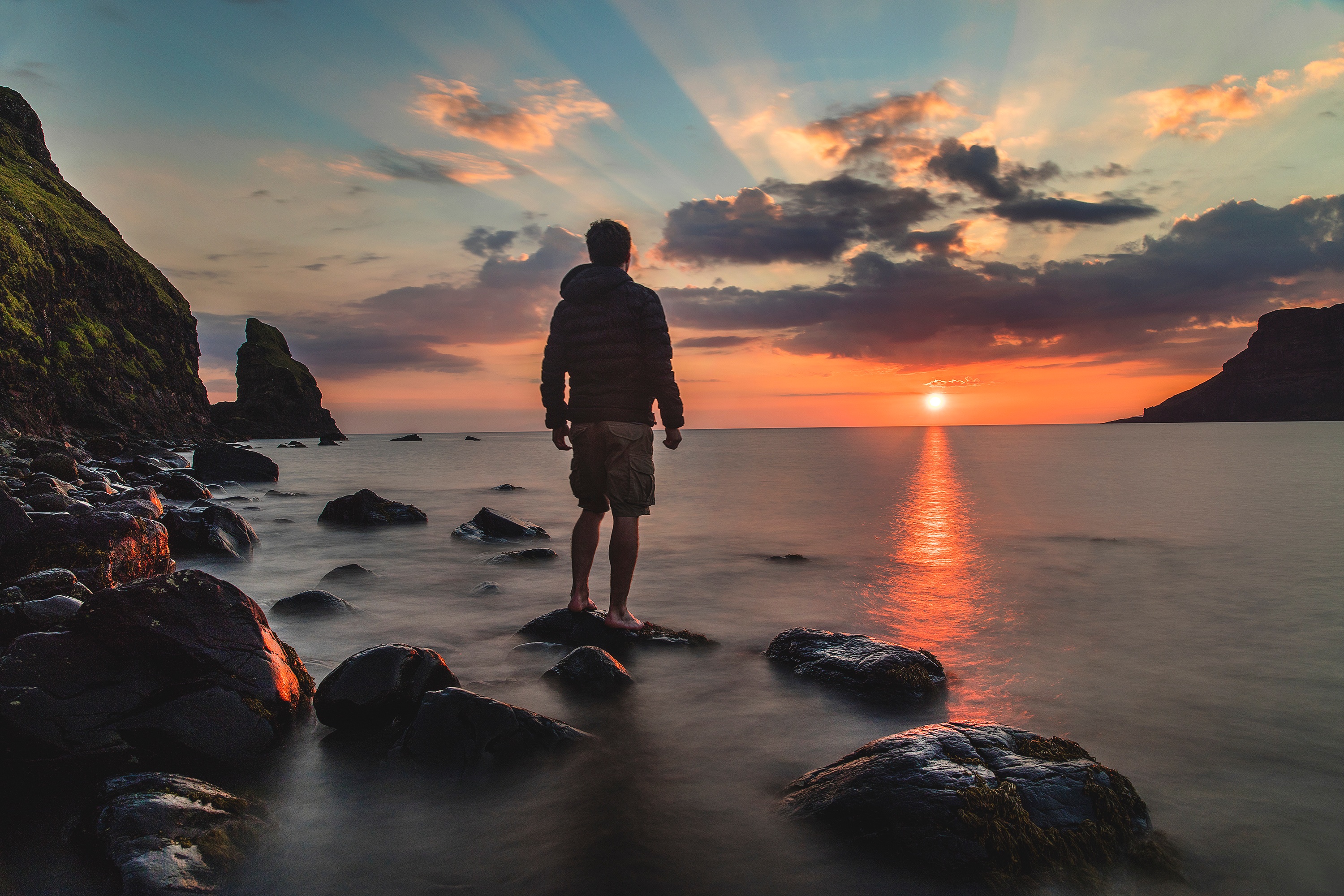
Depth in photography: Bright things retract, Dark things attract
Oddly enough, the opposite is true when it comes to photography. When you’re choosing your photos to use in your website layout, the photos have the opposite effect from your illustrations and site design. In regards to your photos specifically, make the brightest areas what you want to hide, and the darkest areas what you want to highlight.
Keep the page balanced
Having a heavy weight page doesn’t make it more or less important than the next. Remember that it’s the content that people are coming to your site for and it must remain relevant. Keep your readers interested by aligning your content and images from top to bottom and from left to right (if your page is for English sites anyway). Having everything heavy weighted on the left, right, or center may (but not always) deter your users from exploring over areas of your site. Now you may be thinking, shouldn’t the most important stuff be given more real estate and be heavier? Not exactly, just because your main content area is large doesn’t mean it has to be heavy. A widely known myth about the web is that users don’t like to scroll. With the advent of the blog, pages have become extremely long, yet readers don’t mind because the content is relevant and interesting. Keep that in mind the next time you’re worried about something being below the fold. If you’re worried about readers not seeing it, then maybe your content isn’t interesting enough for them to scroll down!
Just as designers are expected to know some web development, I believe every designer should know something about proper photography – about light, composition, and balance – because it has so much to do with making your site appear professional and creative. Here are some great examples of portfolios that focus on photography in website design: http://vandelaydesign.com/blog/galleries/best-photographer-websites/